Pencil Pet Portraits - Artwork to Photo Comparison
Welcome to my pencil pet portraits artwork to photo comparison page. My aim as a pet portrait artists is to capture the essence and true likeness of your pet. However it's more than that, otherwise you could just enlarge a photo. It's about adding a spark and breathing life into the artwork that perhaps isn't present in the photo. Of course it goes without saying that I can add or remove elements to help intensify the image and allow you the viewer to really be drawn into the eyes of the subject which will inevitably steal your heart....
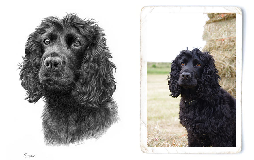
Pencil Drawing of Brodie
A few things were changed in the portrait of Brodie, obviously the removal of the field and straw bales behind, but also the removal of his collar and the line of fur going to the corner of his eye. My client wanted a close up, focused portrait of Brodie, where you could really hone in on his eyes. Plenty of time was taken drawing the curls and creating the three dimensional form. It also took some time to layer the pencil to create Brodie's dark rich coloured fur too. You can see Brodie's portrait in full in my Pet Portraits Gallery.
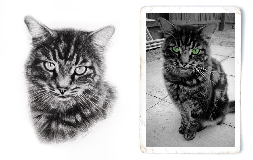
Pencil Drawing of Jet
My client only had a few photos of her cat Jet, who sadly had passed away. upon gathering everything she had, she felt she didn't have the perfect photo of Jet to remember him by and very few were good enough to draw from. None were the original photos so they were much lower in resolution than they once were. I was getting a little worried I wouldn't be able to create a portrait for her. Thankfully Rachel came up with this photo which although had been resized and filtered in Snap Chat, being in black and white was no concern for me working in pencil! For this portrait, it was important to really bring forward the face and facial features, to allow Jet's personality to shine through.
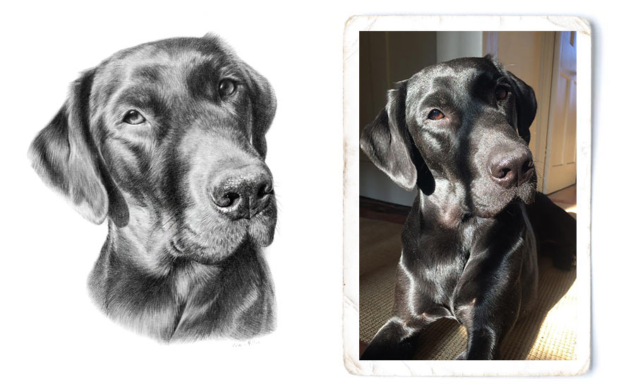
Pencil Drawing of Dilly
The drawing of Dilly was a tricky one as you can see a large odd shaped shadow across Dilly's face. So it was important to decide what to do with the shadow - remove, lessen, enhance etc. Both the client and myself decided to lessen the shadow as taking it away altogether might remove some of the three denominational from of the dogs head. Black labs are all about the shine and Dilly is in bright sunshine. By lightening the shadow, it also allowed her eye to be more in focus too.
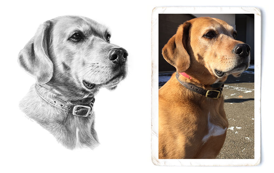
Pencil Drawing of Rusty
Similar with the drawing of Dilly above, Rusty's photo was taken in full sunshine which has again resulted in deep shadows. This is great as it really helps to create the three dimensional form of the head of the subject, however in a pencil drawing, I often feel that when there are such bright light areas on the dogs face too, creating the shadows too dark can make the whole portrait a bit stark. So its a balancing act between varying the tones enough to portray the sunlight and light fur along with the shadows too. I thin it balanced it just right on Rusty's portrait. Hopefully!
Pencil Drawing of Simba
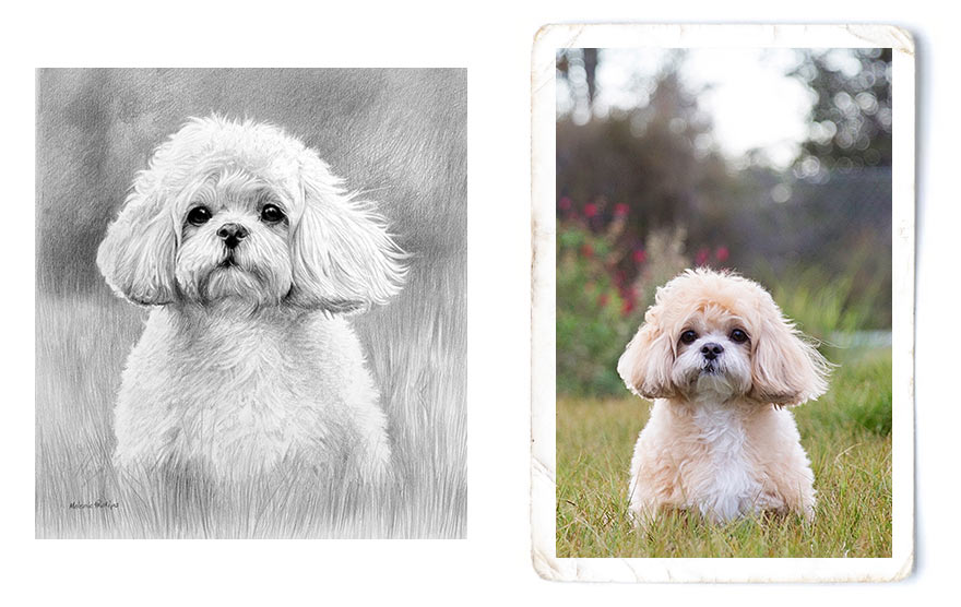
The photo of Simba was another tricky one. The photo was quite low in resolution, so although it was an amazing photo, when you actually zoom in, the photo was pretty pixelated. It is tricky to add detail where it cant be seen. Also here we have Simba with the most adorable eyes, which really are the focus of the drawing. So by shading the background, this allowed the white of the fur to stand out, allowing the face and eyes to really stand out and be the full focus. My clients were ecstatic with the drawing, so thrilled which I was really pleased about.
Pencil Drawing of Betty
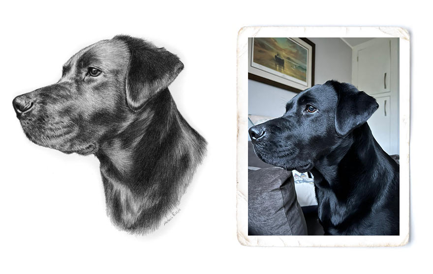
The drawing of Betty is a very straight froward drawing form the photo with little changes. It is enhanced from the photo as every time I look at the photo my eyes are drawn to the white block under Betty's chin from the cushion behind along with the arm of the chair right under Betty's chin. So the drawing immediately stands apart from the photo in that respect. Definitely one of my favoruite drawings to date.
Pencil Drawing of Freya
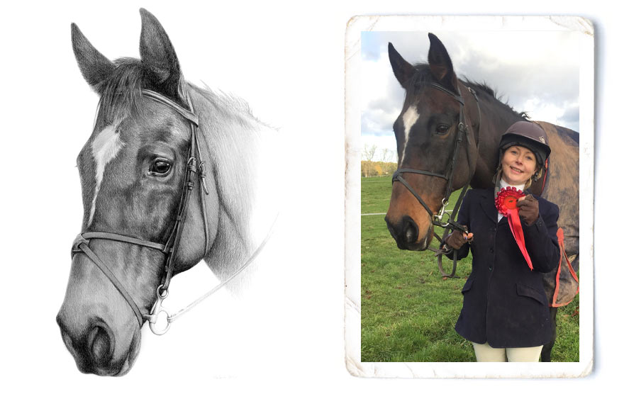
The drawing of Freya gives my clients provides two different things. First of all a stand alone portrait from the photo which they will cherish for many years to come giving an array of wonderful memories of a beloved horse. Then the photo still represents something special about the eventing day with my client competing. The main change here was to move the reigns into a better position and to try to fade the drawing off to give the illusion of a body without it looking 'cut out' so to speak. The portrait was pretty large so I felt it was an important aspect of this piece.
Would you like to see other drawing to photo comparisons?
If you would like me to add more drawing to photo comparisons here and would like further explanations of my work, please feel free to leave me a message in the WhatsApp box to the right. Love to hear from you.